
SOLARA WINES
Type
Brand Identity / Web Experience
Location
Mendoza, Argentina
Year
2026
Deliverables
Art Direction
Brand Identity
Motion Design
Web Experiences
Solara Wines partnered with katto to create an identity and digital experience rooted in the atmosphere of Mendoza. The challenge extended beyond building a premium wine brand — it required translating landscape, craft, and culture into a visual language that felt contemporary without losing a sense of place. The project combined strategy, identity, art direction, and web experience into one connected system designed to evolve over time.
The process started far away from logos and interface design. Early conversations focused on understanding the landscape surrounding Solara and how the physical environment shaped the character of the brand. Vineyards stretched across open terrain while mountain silhouettes remained visible in nearly every direction. Research expanded into references beyond the wine industry. Architecture books, travel photography, independent magazines, and cinematic visuals helped establish an atmosphere that felt more human and less conventional. Rather than replicating familiar luxury aesthetics, the goal became creating a world with warmth and restraint. These discoveries established a creative foundation where environment became more important than trends.


The identity system was designed around simplicity and precision. Typography became the central element, supported by muted colors inspired by stone textures, dry landscapes, and the shifting tones of evening light across Mendoza. The logo itself intentionally avoided obvious references to vineyards or wine culture. Instead, attention shifted toward proportion, spacing, and subtle details that could create character without relying on symbolism. Supporting assets created a system designed to work across labels, packaging, editorial layouts, and digital environments while maintaining consistency.
The digital experience was approached more like an editorial platform than a traditional winery website. Instead of immediately presenting products, visitors are introduced to atmosphere first through imagery, motion, and slower content progression. Subtle transitions and layered movement were integrated throughout the experience. Interactions were designed to feel calm and intentional, creating rhythm without becoming distracting. The intention was not simply to showcase bottles and collections, but to create an environment that visitors could spend time exploring.

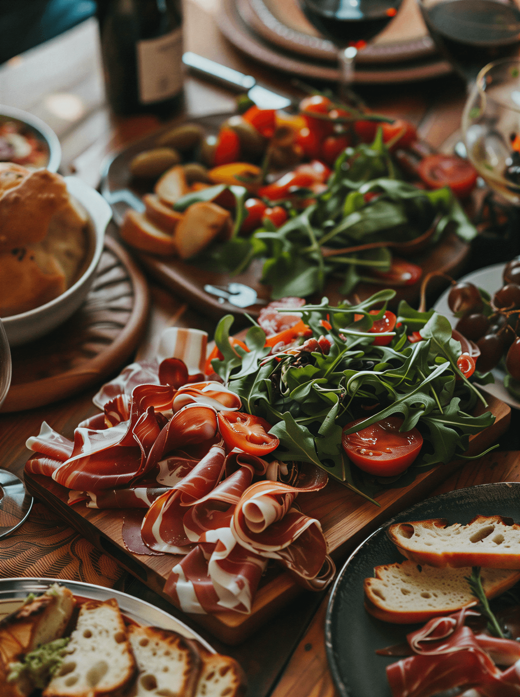
Art direction became an important layer connecting every deliverable. Photography references prioritized natural light, tactile materials, and compositions that felt observational rather than highly staged. Campaign imagery moved away from polished luxury conventions. Instead of perfect studio environments, visual content focused on landscape details, texture, and small moments that felt spontaneous. This approach created a flexible visual language capable of extending into social content, campaign assets, and future product launches.

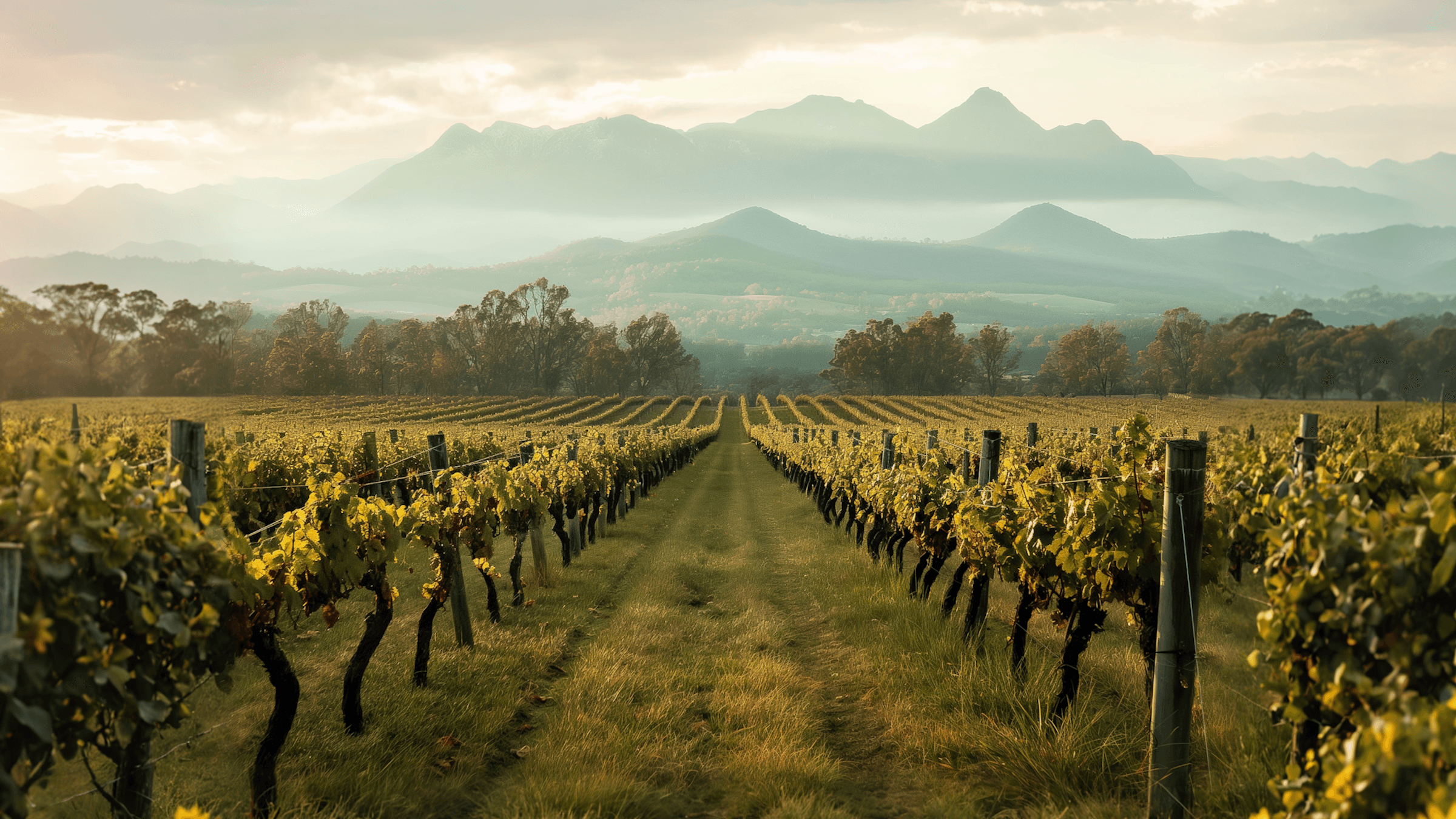
The completed project introduced a visual system designed to grow with Solara over time. Identity, storytelling, and digital experience were developed as connected components rather than isolated deliverables. More importantly, the project demonstrated how a brand can communicate atmosphere as much as information. Every design decision contributed to a broader narrative shaped by place, emotion, and experience. The result became a brand world that feels quieter, more immersive, and intentionally timeless.

Type
Brand Identity / Web Experience
Location
Mendoza, Argentina
Year
2026
Deliverables
Art Direction
Brand Identity
Motion Design
Web Experiences


Inquiries
We work with a limited number of clients each year. If you have a project in mind, get in touch. Briefly outline your idea, scope, and timeline — we’ll respond with next steps.